Showing posts with label Photo Tips. Show all posts

Saturday, December 1, 2012

How I Watermark My Photos using Photoshop

A watermark is simply a transparent layer applied over a photo.  What I'm going to show is the method of watermarking that I use.  I can't say that it is the only way, or the best way, to watermark a photo ... it's just the way I know, and I'm sharing it here in the hopes of helping anyone who may need a bit of advice on the subject.

I format my photos using Photoshop 6.0.  It is the oldest version of Photoshop that we have that will run on my Dell laptop.  When we bought this computer three years ago (or was it four?), my genius computer guy husband wanted to upgrade all my software to the latest and greatest versions.  I protested, since I didn't want to have to learn a whole heap of new programs, so we compromised.  I have the newer versions of some programs, and older versions of others.  I don't know how these instructions will apply to you if you run a different photo program, or a newer version of Photoshop or Photoshop Elements.

I also want to say that all of the photos I publish here on the blog are formatted to be 640 pixels on the long side for horizontal photos, or 480 pixels on the short side for vertical photos.  This significantly reduces the file size and reduces the chance of running out of storage space on Blogger.  My watermark is formatted to be used on this size photo.

Let's get started.  First thing is to make a photo file to use as your watermark.  It can be anything you want.  Mine is simply a file with 'Hartwood Roses' typed in pale grey in Blackadder font.  It looks like this:


How to Make Your Watermark File.
 
1.  In Photoshop, Click 'File' and 'New' and create a blank file 500 pixels wide.  The height can be whatever, since it doesn't really matter.  Click 'OK'.


2.  Click on the Type Tool.  Choose a font and size and color.  Type your desired watermark text onto your file.  (For this example I used my same watermark size and font, but a different color so you can see it easier.)  This creates a second layer in your image.


3.  Do not flatten your image!  You need the two layers to be able to use it later.
 
4.  Click 'Save', name your file, and you now have a watermark to use whenever you are editing your photos.  I store my watermark file in the same folder where my formatted blog photos are stored, and I named the file so it's always the first file in the folder for easy access.  This is a .psd file (not the .jpg or any other image file that you are used to seeing.)


How to Use Your Watermark File.
 
Whenever I format and edit photos for the blog, I open my Watermark File along with all the other photo files I want to use.  For this example, let's use a photo of Ruby napping on the sofa.


After formatting and resizing your chosen photo, use the Rectangular Marquee tool to section off and copy the text portion of your Watermark File.


Now paste the copy onto your photo.  It pastes right into the center of your photo, but don't worry ... we'll move it in the next step.


Use the Move Tool to slide the text where you want it.


I forgot to say that your Watermark layer shows up as 'Layer 1'.  Your original photo layer is 'Background'.


I adjust the opacity of my Watermark so it fits the tone of the photo, so it doesn't interfere too much with the photo itself (but will still be a b*tch for anyone who may try to remove it).  The percentage of opacity is different for every photo ... I usually just wing it.  For this photo of Ruby, I reduced it to 35%.


Flatten your photo, save it in your choice of file format (I use .jpg) and you're finished!!


Photoshop is the only photo program I have really used for my online photo formatting.  (Occasionally I will play with PicMonkey, but the fact that I can only open one photo at a time using that site is a pain ... and I always open my resulting image in Photoshop afterward to add the watermark.)   Since I don't know how other programs work, this tutorial may or may not be of any use to you.  At the very least, perhaps this will help some folks understand the process of watermarking a little bit better.
 
... and I hope you aren't completely confused.
 
********************************
Tune in tomorrow to see what some of our fellow bloggers see as they look out their kitchen windows.  There's still time to show everyone YOUR view, if you want to participate.  Send your photo, and a short description, to connie@hartwoodroses.com.  Make sure I get it by this evening, please.
 

Monday, August 15, 2011

Take Better Photos ... Turn Off Your Flash

I worked outside for a little while yesterday morning, on a project for the sewing room that I will show you soon.  After lunch, the sky was threatening to storm again, so I changed gears and came inside to rearrange and organize the sewing room a bit. 

Alice followed me, as she always does when I go into this room.  She usually begins by winding around my feet begging to be picked up.  After a suitable amount of hugging, I put her down, and she finds a cozy spot to relax and watch what I'm doing.  Yesterday, her spot was on top of some needlepoint in one of the cubbies of my wall unit.

She looked perfectly content and posed in there ... very photo worthy.  My little camera was in my pocket (you already knew that, didn't you), so I pulled it out and snapped a quick photo.  I didn't realize that the flash was turned on, and this was what I got ... a perfect example to show you why you should NOT be shooting direct flash if you want to get a good photo.

with flash


The most obvious problem is that Alice's eyes are electric, glowing yellow ... as the flash reflects through her pupils and illuminates the inside of her eyes.  The flash makes everything in this photo bright and harsh.

I quickly turned off the flash, and snapped another photo.

without flash


Isn't this one a lot better? 

In the interest of full disclosure, I must admit to a small amount of editing to both of these photos using PhotoShop.  On both photos, I adjusted the levels to moderate the shadows, and I did a tiny bit of color correcting because my camera makes photos a bit too blue for my eye.  (Sliding the color balance 5-10% toward the yellow usually fixes this perfectly.)  I sized the photos to 640 pixels on the long side, and I sharpened them ... like I do with all the photos I publish.  Nothing to radically alter them, just enough so they display well on a monitor.

The next time you're taking photos inside, turn off your flash and see what you get.  You may need to use a tripod to keep your camera steady for the slower shutter speeds necessary in lower light, but I can practically guarantee that you will be happier with your photos.

If you try this, be sure to let me know how it works for you.

Friday, January 28, 2011

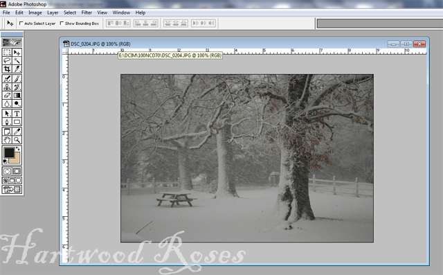
PhotoShop Lesson: Accentuating Snowy Trees

Thank you for all of the lovely compliments on my snow photos yesterday.  Most of the success of these photos was because the light during the snowstorm was completely perfect.  All I had to do was adjust the White Balance on my camera, frame the shots, and click away. 

When I loaded the memory card into my laptop to view the photos, I decided that they could use a little bit of tweaking, a lot like I did when I used to develop photos in the darkroom in the Dark Ages of film photography.  It was a simple matter to use PhotoShop to darken the trees, increase the contrast, and sharpen up the blowing snow.

Here is what the photo of the three trees looked like straight out of the camera.  It's okay, but I knew it could be better.


After we finish with it, it will look like this:


Open the photo in PhotoShop.  The first thing I did was adjust the size of the image to 640 x 480, so I was working on the image in its actual size.


To adjust the levels to darken the trees, Click 'Image',  'Adjust',  'Levels'.


And you get a pop-up window that looks like this.  Click on the black eyedropper icon, then click somewhere on the photo that you want to tell PhotoShop should be true black.  I clicked on the center of the hollow part of the front tree.  If you don't get the result you want when you click on the photo the first time, click around until you like what you see.  If you totally hate the results, click Cancel and close the window, and your photo will remain unchanged.


My next step was to increase the white range (Don't quote me on this terminology, because I don't know if that's what it's really called.)  Again, click to adjust the Levels.  This time, I grabbed the white-point slider and I moved it until I liked what I saw.


To make a sharper contrast between the lights and the darks, click 'Image', 'Adjust', 'Brightness/Contrast'.  Click and hold the sliders, and drag them where you think the photo looks best.  I brightened the photo a bit, and increased the contrast considerably.


If you look at the original photo, you see that I had to deal with the pesky issue of my daughter's car antenna in the lower left corner.  This distraction was dispatched fairly quickly with a few strokes of the PhotoShop airbrush.  (I can show you how to use airbrushing later, if there's interest.)  The "H" on my Hartwood Roses watermark disguised the fact that there was ever an antenna in the picture.


The last step is to sharpen the photo, to accentuate the texture and details, and to focus on the emotion of the blowing snow.  Click 'Filter', 'Sharpen', 'Sharpen'.


That's all there is to it!


I use PhotoShop 6.0, which is the oldest version of PhotoShop that will run on my new laptop.  There are newer versions out there, but they are considerably different than what I'm used to and I didn't want to have to learn how to use them.  I have never used any other photo program besides PhotoShop, but I imagine that the concept of adjusting levels and contrast and sharpening images is similar no matter what program you have.

Class is over.  Any questions?

Friday, January 14, 2011

Tips For a Better Blog ... Large Photos

Do you use the largest possible photos on your blog?  If not, here's a quick Blogger lesson to show you how.

This sunrise photo ...


... wouldn't have nearly the same impact if I had left it the size that Blogger made it when I imported it into this post.  See?


The size that a photo appears in my posts has nothing to do with the photo's file size. All of my blog photos are 640 x 480.  I save them this size I when I edit them in PhotoShop.  (That's also where the watermarks come from)


While writing a blog post, when I insert a photo, it looks like this on the screen:


Click on the photo in the Blogger editor, the photo will highlight and a bar with various selections will appear below it.  To display the photo as large as possible, which I do, click 'X-Large'.


Your photo will now look like this:


and when you publish your post, your photo will be big and beautiful!


Any Questions?


Related Posts with Thumbnails